A Designer’s Favorite Go-To Neutral Paint Colors
May 28, 2025

Picking a paint color sounds easy… until you’re standing in front of that wall of swatches with 47 shades of white. It’s one of the trickiest parts of a home project and believe it or not — it’s a decision that can totally transform (or unintentionally clash with) your space. At Tailored Spaces, we work with paint colors every day while pairing them with cabinetry, countertops, and finishes, so we thought we’d share a few of our tried-and-true favorites along with some helpful tips for choosing your own.
Our Favorite Neutral Paint Colors
Let’s be honest — neutrals will always be in style. But the right neutral makes your space feel effortlessly timeless. Here are a few we find ourselves reaching for again and again:
-
Dove Wing by Benjamin Moore: A soft, warm white that pairs beautifully with both bright and moody spaces.
-
Aesthetic White by Sherwin Williams: That perfect creamy not-too-white, not-too-beige tone for walls that need warmth without looking yellow.
-
Vanilla Milkshake by Benjamin Moore: Our favorite go-to for ceilings and trim — it’s that in-between color that feels fresh but not stark.
-
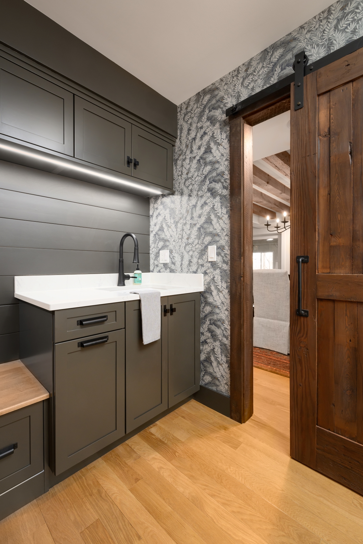
Urbane Bronze by Sherwin Williams: Technically a deep brown with green undertones, but it reads as the perfect moody, dramatic color on cabinetry and built ins. (Shown in image above.)
-
Vintage Vogue by Benjamin Moore: A rich, classic green with a hint of vintage charm. Fun fact: our own office cabinets are painted this color!
-
Heron Plume or Egret White by Sherwin Williams: Ideal for those seeking a greige (gray + beige) with soft, cozy undertones.


Finish Matters More Than You Think
Beyond just color, the paint finish you choose affects both the look and durability of your walls. Here’s a quick cheat sheet:
-
Walls: Go for an eggshell or satin finish. It gives a soft sheen, hides imperfections better than flat, and it’s easier to wipe down.
-
Ceilings: Stick with a flat or matte finish. It hides surface flaws and avoids any weird glare from overhead lights.
-
Trim, Doors, and Cabinets: Use semi-gloss or satin finish. It’s durable, cleans easily, and makes those architectural details pop.
Lighting Will Make or Break Your Paint Color
This is where most people go wrong. The color you fall in love with at the paint store? It’s going to look completely different in your home. The undertones in your floors, cabinetry, and even the direction your windows face will pull out different shades you might not expect.
Our advice:
-
Bring multiple paint samples into the room you’re painting.
-
Look at them next to your cabinetry, floors, countertops, and tile.
-
Move those samples around to different walls and corners.
-
Check them in morning light, afternoon, evening, sunny, cloudy — you get the idea.
At Tailored Spaces, we literally haul our samples up to the windows sometimes because the selection room lighting just doesn’t cut it. Natural light makes a huge difference, and it’s worth the extra effort.
Final Thought
If you’re feeling overwhelmed, don’t worry — you’re not alone. That’s why we love helping clients not just choose colors but select finishes and paint pairings that work with your cabinetry and surfaces, not against them. And hey, if you need a second opinion on that swatch you’ve been staring at for three days straight… you know where to find us.
Happy painting! 🎨✨
Written By: Karissa 5/27/25

